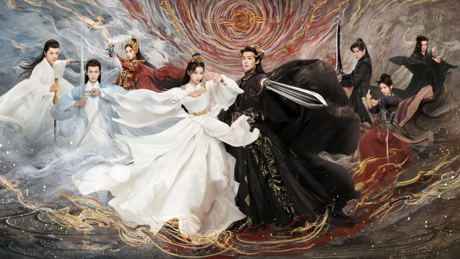
Saturation is a fundamental aspect of color theory, often delineating the vibrancy and intensity of a hue. It refers to the purity of a color, influencing the emotional and psychological impact it can convey. The more saturated a color, the more vivid and striking it appears, while less saturation results in muted or desaturated tones that may feel softer or more subdued. Understanding saturation lends insight into how colors interact and how they can be leveraged to evoke specific feelings or ideas.
At its core, saturation assesses the presence of gray in a color. A highly saturated hue lacks any addition of gray, presenting its full spectrum of intensity. Conversely, when a color is desaturated, it incorporates varying degrees of gray, which alters its appearance and emotional resonance. Think of the vibrancy of a sunflower yellow; in its purest form, it radiates warmth and positivity. Introduce gray, and the yellow becomes pale, perhaps invoking a sense of nostalgia or melancholy. This transformation illustrates why artists, designers, and advertisers are often captivated by the way saturation can manipulate perception and emotion.
The saturation of a color does not exist in isolation; it is influenced by context, lighting, and complementary colors. Under bright sunlight, vibrant colors achieve their maximum saturation, whereas the same colors may appear washed out on a cloudy day, showcasing how environmental factors play a pivotal role in color perception. This phenomenon can be tactically utilized in design: for instance, in a branding context, highly saturated colors can attract attention and generate excitement, while a desaturated palette may create a feeling of sophistication and elegance.
In the realm of visual communication, saturation also intersects with cultural implications. Different cultures attribute diverse meanings to colors, and variations in saturation can further nuance these interpretations. In Western societies, a saturated red often evokes strong emotions—ranging from passion to urgency—while in other cultures, the same hue might convey a different sentiment entirely. This underscores the inherent subjectivity in color perception and the reasons for fascination: color is both universally understood and intensely personal.
Designers frequently manipulate saturation to create visual hierarchies. A highly saturated color might be strategically placed to guide the viewer’s eye toward a call to action, while adjacent desaturated colors can recede into the background, providing balance without distraction. This orchestration of saturation leads to compositions that are not only aesthetically pleasing but also effective in delivering a message. The skillful use of saturation amplifies brand identity, enhances user experience, and elicits emotional responses—each element plays a crucial role in visual storytelling.
Yet, the psychological effects of saturation reach deeper than just visual aesthetics. Research suggests that colors with higher saturation can stimulate the senses, leading to increased heart rates or heightened emotions, while desaturated colors may promote calmness or introspection. This duality of effect offers a powerful tool for artists and designers. The choice of saturation can transform a canvas or a digital space into a dynamic narrative that resonates with viewers on an instinctual level.
In conclusion, saturation in color is a multifaceted concept that extends beyond mere visual whimsy. It encapsulates the interplay of purity, context, and cultural significance, transcending basic color interactions to influence emotional responses and perceptions. As we engage with saturated hues and their more muted counterparts, we embark on a deeper exploration of color’s role in communication and artistry. Understanding this tantalizing phenomenon not only enriches the practice of design but also deepens our appreciation for the vivid world around us.


